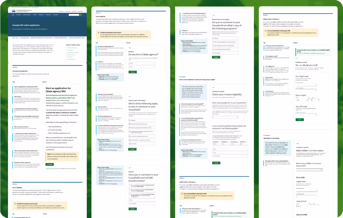
A model application for WIC benefits

Making it easier to fix clunky government forms 

A mockup of the WIC model application on a laptop against a green background. The mockup includes a sample question of a form, with annotations on the left that explain the form questions and design

I led the end-to-end UX research and design process for a new model application that makes it easier to improve WIC applications.

Partner

Food and Nutrition Service (USDA)

My role

  • User research
  • Content strategy
  • Copywriting
  • UX writing
  • Interface design

18F PROJECT TEAM

  • Service designer
  • Product designer
  • Product manager
  • Engineer

Problem

It's hard for people to apply for food stamps.

Millions of caregivers and babies rely on WIC every day to get the healthy food, infant formula, and breast pumps they need. It’s an effective program once you’re signed up. But a combination of unclear requirements, confusing language, and limited online services deter many families from applying. 

It’s a hard problem to fix, because WIC applications differ for every state.

WIC’s federal office came to 18F for help advising their state agencies on how to improve the WIC application process. WIC is federally funded, but it’s individually run by 89 state agencies in different states, territories, and tribal nations. That’s almost 89 different websites and ways to sign up.

Approach

I led UX research and design for a model application to make it easier for state agencies to improve their own WIC applications.

  • Conducted a sweeping landscape analysis of current application processes across the country.
  • Led multiple rounds of research and prototyping, and led usability testing for two form prototypes with WIC applicants and staff.
  • Prepared concept sketches of different ideas for feedback from WIC staff across federal and local teams.
  • Compiled an extensive rubric to evaluate prototype options based on desirability, feasibility, and viability.
  • Wrote how-to articles that accompanied the template, for local staff to reference in making changes to their current application.
  • Prioritized needs across very different stakeholders and users, including WIC applicants, the federal office team, and frontline WIC staff, local program directors, and vendors who maintain WIC software.

Insights

We couldn’t improve all 89 separate applications, but we could make a template for state agencies to repurpose.

With 89 different application processes across the country, we couldn’t make a universal form that would suit every branch.

After testing a variety of prototypes with WIC applicants and staff, a model application emerged as the most viable option. It struck a balance between what applicants and staff need in the long run, but what the WIC federal office could reasonably implement right now. 

A large blurred out spreadsheet. Cells are colored green, yellow, or red to signal how well the prototype met the project goals and user needs

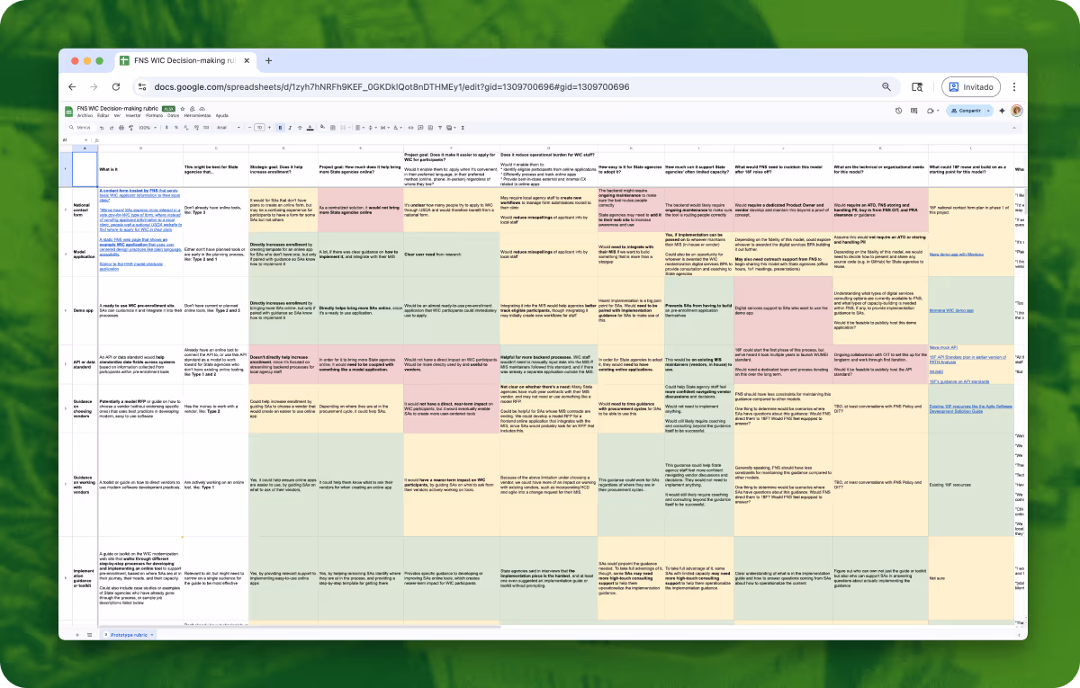
I created a rubric that weighed all our options to help us decide.

Users wanted a potential new form to collect more information about them, not less.

We then tested two different types of forms for the model application. One collected a lot more information than the other. Almost everyone preferred the longer form. The longer form let applicants answer personal questions about their income, pregnancy, or race in the privacy of their own home. It gave frontline staff a clearer picture of their new applicant before their first in-person meeting.
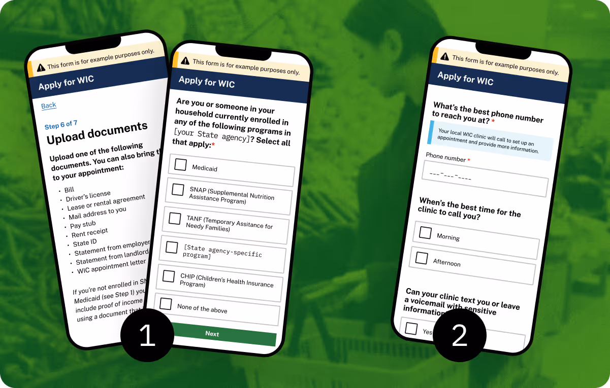
Three phone screens of different parts of a WIC application form, organized into two different screens

I led usability testing sessions with WIC applicants and staff. We tested two very different application forms to see which one applicants and staff preferred.

RESULT

We created a comprehensive, usability tested form template for local branches to reuse.

The WIC staff we spoke with know their forms are hard to fill out. They want to improve them. It’s the how that’s tough. Our model application lets local branches:

  • Use our user-tested language to reword or cut unnecessary questions from their current form.
  • Give clear direction to their vendors on how to start from scratch or improve their current form, without WIC staff needing a technical background themselves.
  • Borrow the same U.S. Web Design System (USWDS) components we used to improve their form’s accessibility.

I also wrote how-to articles that accompanied the template, for local staff to use as instructions in making changes to their current forms.

Four screenshots of the WIC model application. Each page of the form is on the right, with annotations on the left that explain the form's questions and design

I acted as a dual researcher and writer, leading user research and UX writing for a content-led site.